
Another week by but this time I have a completed cut, and as mentioned in the previous entry it’s subject matter is atypical of my usual paper cuts.
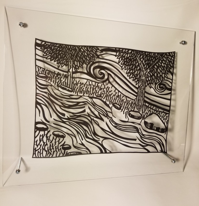

Since the shapes were a lot more representational than usual this one took a little more planning. Also, since the person that was doing the planning didn’t know the rules to making all the little forms stick together and also not tear themselves apart while being etched out, it took a lot of on the spot changes as well.
All together though I think this entire piece took a lot less time than my other works. Lots more open spaces and a lot less small overlapping details. If I hear word that “Pictures of things look better/more interesting than a bunch of triangles” maybe I’ll make some more like it.
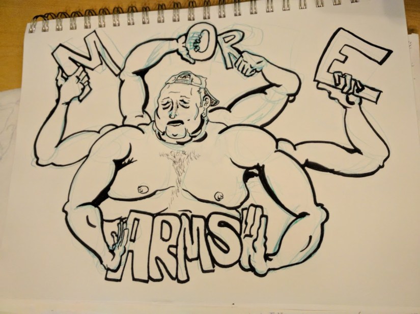
While digging around online I also found this terrible and creepy logo I did a long time ago.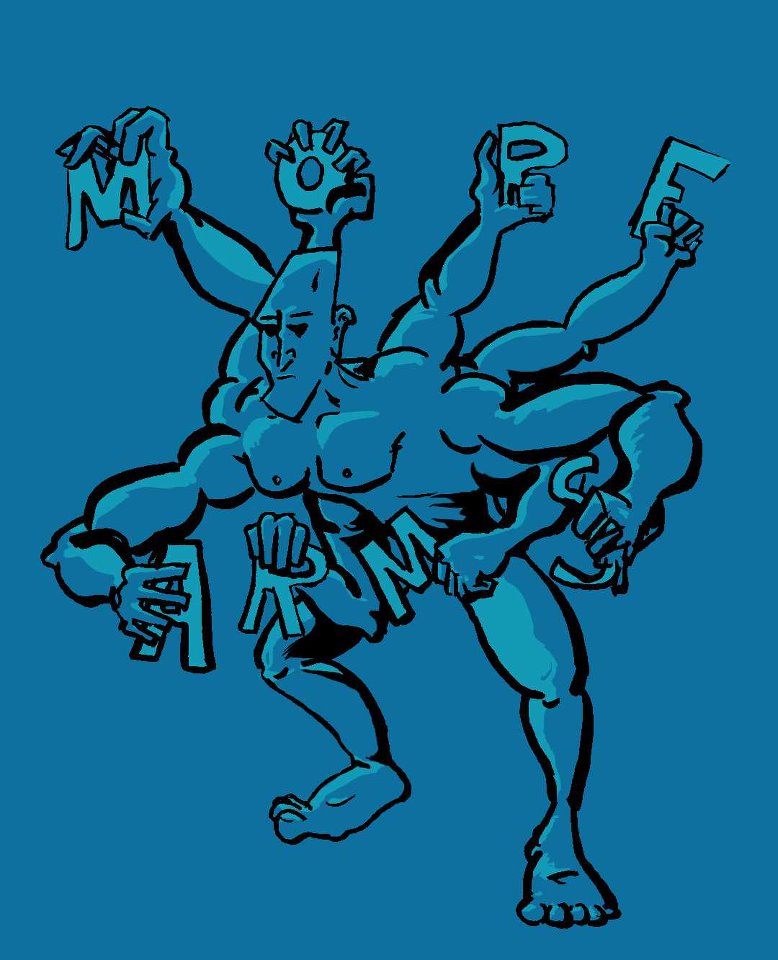
Very illegible, but in honor of finding it I also inked his rejected cousin of a logo.
Fun time nightmares.
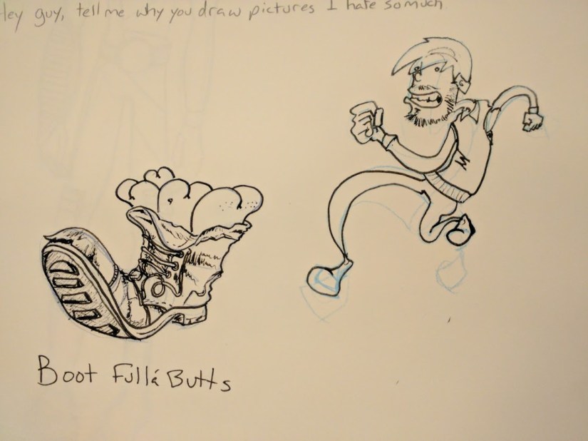
Lets close this all out with something different.
-Eric

You take after your father.
LikeLike
You take after your father.
LikeLike
Love the paper cuts. Really striking. Good stuff!
LikeLike
Thanks so much! Glad you like them!
LikeLike